New design!
You may have noticed a new look on my blog. There were a number of aspects of the old design that were starting to feel very dated.
Small font sizes, cramped content, and the sidebar, were just a number of things that I wanted to rethink; so when I started to work on the redesign, I made the content the sole focus, increasing the font size, adding some more breathing space, and removing any unnecessary distractions.
The font I selected is Source Sans Pro, it provides a nice thin weight that contrasts well with the colour scheme.
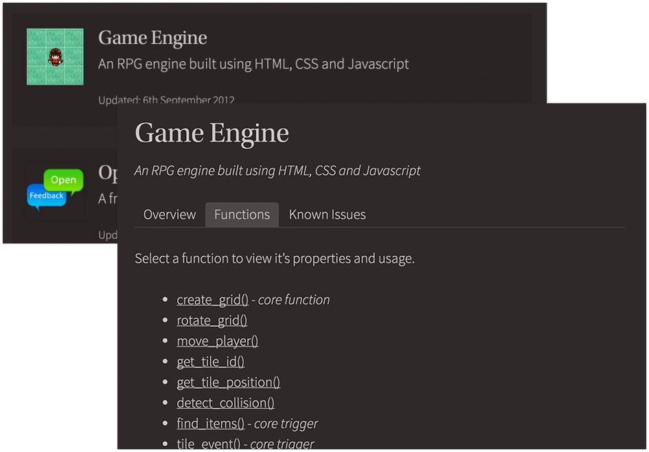
I've also made some updates to my projects section.
There are a number of things I'd like improve or add, for example Books is due an overhaul. I want to add filters so you can list by genres, rating or date read.
I plan to add autocomplete to the search box, so that if you are searching for a title, you'll get the result straight away. I'd also like to add a few more metrics to the site (how long since I last tweeted, how far have I walked today, etc).
Also for people that struggle to read light text on a dark background, I am going to add an option to toggle between a light and dark version of my site.
If you have any ideas feel free to add them in the comments or send me a tweet.